[En] Ore.e Ref: “D2T (Digital-to-Tangible )– Services”

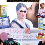
An UN-DI (Un-Digitization) of a receipt documenting a performance at a restaurant.

Ever wondered what will happen to your digital documents in the future or how long can you store a thermally printed receipt? Our most common data storing technologies are unsuitable for storing data for more then a couple of years. It’s evident that the majority of digital data we produce today will not be accesible in the future (and it seems that most people are quite unaware of this). This is why we at Ore.e Refineries have kicked off a service targeted for people who want to encapsulate their digital (and otherwise fragile) data into formats which last trough the ages. We call this process Un-Digitization (UN-DI) and the service is called “ D2T (Digital-to-Tangible)– Services“.

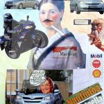
An UN-DI (Un-Digitization) of “Helsingin Sanomat” webpages (2008).

When we begun developing the D2T–Service in 2008 we focused exclusively on digital contents. As the first experiment we un-digitized the front page of the most read online newspaper in Finland, Helsingin Sanomat. I was so satisfied with the result I contacted the newspaper staff in hopes making a project with them. The idea was that we’d un-digitize the entire online newspaper during a summer. The act of artists (Me, Jesse Sipola and friends) working to re-mediate a webpage in to a manuscript would have been an interesting event to witness. I exchanged emails with their staff for a year and was helped by Matti Koistinen (from art360) to develop the concept. But I was unable to convince the editorial staff of importance of the project (Details of the proposal are found in Finnish on Ore.e Ref main site in Finnish). I’m still optimistic that the service will eventually find (or create) it’s market niche. Meanwhile we have begun to un-digitize non digital documents too.

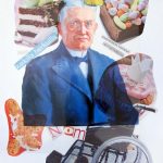
An UN-DI (Un-Digitization) of a receipt documenting the sale of 10 invisible chairs by Jesse to Manama.
The UN-DI versus the original receipt as a looping .gif animation.

Academics hang university diplomas on their office walls but Jesse has a un-digitized receipt documenting a very important sale on his (more on the sale in Finnish). Thermally printed receipts are extremely vulnerable. If they are left in the sun or stuffed in tight trouser pockets they will fade within hours. Receipts are very interesting documents to study and if I remember right archeologist have used data harvested from old receipts (concerning livestock sales) when attempting to estimate sizes of some ancient cultures. Today we are all involved in a historical receipt faraud of a sort as data printed thermally is not even intended to last for long.

People treat receipts as neutral documents but looking at them closely one can find symbols and signs which tell of a bigger story. They are compressed with information on economical legislation, they can be directly linked to global payment card systems and they tell a lot about the digital technologies involved in trade and global logistics. It’s not surprising that people tend to store some important receipts for other then taxation purposes too. They are proof of rites of passages.. I could imagine someone framing a receipt they got when buying their first car for example.
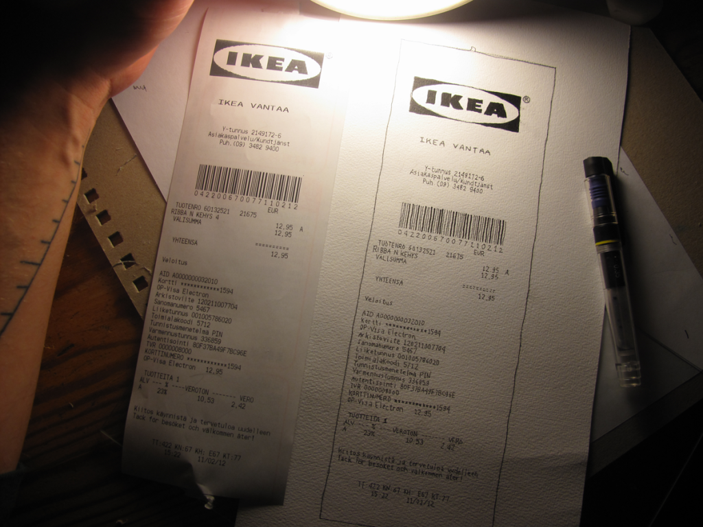
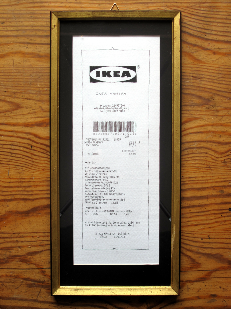
The original is stored behind the UN-DI version.

Working with D2T we’ve discovered that the more beautifully data is stored the more likely it is to last. In the example above a mondane un-digitized Ikea receipt has reached new aesthetic heights. I plan to continue with the Ikea theme but even in it’s current form “Ikea 4#” receipt is likely  to be considered more valuable then a tagless usb-stick. We haven’t bumped into other studies or research on the subject of “Beauty and Digital preservation“. But it seems like a no-brainer that beautifully encapsulated data is better protected then ugly data. So far the only popularly known experiment which somewhat touches the subject has been WD’s efforts of embedding Morse code in their hard-drive casings. Memory-stick designers and hard-drive designers will surely catch up with this subject soon.

The UN-DI process is typically done by hand on acid free paper with the same type of inks used in pre-industrial books. We believe that artifacts which have been reproduced mechanically last poorly but things which have been reproduced in processes which are dependent on manual labor (and devotion of skilled individuals) are persistent. Manual labor adds intrinsic value to the data storage medium. Ultimately “time spend in the reproduction of a copy” proofs that something is important enough to be cherished and preserved. Manual labor (in reproduction) is time consuming and results into unique details on the document.

This idea is rooted in the tale of the “Transmission of the Classics“. During the fall of the Roman empire a lot of scientific writings where losts. This was due to “the fragile nature of papyrus, as a writing medium”. Old texts which where not copied onto expensive parchments crumbled and so manuscripts covering ancient Greek science and philosophy where thought to have been destroyed (Ref. Wikipedia). Luckily original manuscripts where protected by the Byzantine empire and these documents where translated into arabic by early islamic cultures. These writing came accesible for europeans  only after a few hundred years, in the late-middle ages trough encounters with Islamic cultures. It’s speculated that the philosophical and scientific texts Islamic cultures reintroduced to europeans resulted into a mental shift, which prepared them for the era of enlightenment. There is even a myth that some original parchments where stored even though contemporaries could not interpret what was written on them!

Here’s what we’ve dug up on the subject of digital data storing on delicious and please contact Ore.e Ref. if you need the D2T services. To learn more on the receipts documenting a performance at a restaurant look up Framer Magazine Issue 2# “Paying the Bill without Money” (page. 102).

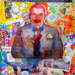
An UN-DI (Un-Digitization) of a receipt documenting a performance at a restaurant.

edit 20140303: Similar project found! By Shakeil Greeley

[Fi] Seli-seli seppele projektin viimeistely ja nykytaidekummeus

Featured Video Play Icon

Vuosi työtä Toijalan yhteiskoulun ja Akaan lukion pääportaikon taideteoksen eteen on tullut päätökseensä. Projektin verkkosivut ovat vakiinnuttaneet muotonsa ja kaikkia vuotta kartoittaneet mediat on saatu ladattua verkkoon. Kuvat on julkaistu vapaan käytön mahdollistavin lisenssein ja osa on ladattu wikimediaan odottamaan käyttöä. Paljastamisen yhteydessä (josta video yllä) julkistettiin myös Omistajan opas 1 pdf opus, joka sisältää nelisenkymmentä sivua teoksen ylläpitämistä ja ymmärtämistä edistävää aineistoa. Ore.e Refinerisin ensimmäinen e-kirja julkaisu sisältää mm. koulutehtäviä ja trimmattuja blogi kirjoituksia. Mitä julkisen taiteen tuottaminen opetti?

Seli-seli seppele – Omistajan opas 1 (45 sivua)

Kuten Omistajan oppaassa selostetaan koko projekti lähti käyntiin ihanteellisesta ajatuksesta tehdä teos yhteistuumin koulun opiskelijoiden kanssa. Ihanteellisesti työn luonnoksista olisi saatu palautetta oppilailta ja olisimme yhdessä kouluyhteisön kanssa oppineet kaiken mahdollisen nykytaiteesta ja Akaan salaisesta historiasta. Onnistuimme näissä tavoitteissa vain osin. Vaikuttaa toistaiseksi siltä, että oppilaiden ja muun kouluyhteisön kokemus koko prosessista jäi pinnalliseksi.

Tunne pinnallisuudesta johtuu siitä ettemme ole saaneet oppilailta itseltään palautetta teoksesta. Erilaisia palautekanavia on löytynyt projektin blogissa alusta saakka, myös teoksen verkkosivuilta löytyy palautteen toimituskeinot helposti. Ensimmäinen vaihtoehto on Google Docsin kaavake ja toinen Disqus palvelun kommentointi laite. Yrityksestä huolimatta 0lemme saaneet koko vuoden aikana ainoastaan yhden palautteen (Jossa koko projektia kuvataan rahantuhlaukseksi). Se oli lähetetty Docs kaavakkeella Toukokuussa. Tämä siitäkin huolimatta että levitin koko kaupungin täyteen projektista kertovia mainosjulisteita maaliskuussa ja meistä kirjoitettiin Akaan Seutu lehdessä pariin otteeseen ennen työn julkistamista. Olimme myös lehden aprillipilana. Miten palautetta olisi voinut saada kerättyä paremmin?

Olen itse projektin aikana seurannut tarkasti verkkosivujemme kävijä tilastoja. Olemme käyneet Jessen kanssa Akaalla kuukausittain

Seli-seli seppele: Lukion kuviskurssin elokuvajulisteita

[En] How to Craft Portfolios: Course Material Online

Updated 12.4.2013

The “How to Craft Portfolios” course I run for the Finnish Academy of Fine Art (KuvA) is now complete. The week was fun but unfortunately only 3-5 students attended the course. I’m told this is quite common at KuvA.. To make the best of the situation I changed the program and ended up teaching 3-5 different courses simultaneously; each fitted for a partisipant. This was great as we could look into how the participants write about their art in detail and I’m satisfied with the technical progress too.

The course material we used will remain online indefinitely. I also had time to make an exemplary InDesing “Artist portfolio layout” for download (.zip) . It’s not perfect but it’ll get you started. If I get the opportunity to host the course next year or is the fall I’ll make a similar layout with scribus too. Below is an overview of the week.. Following learning from it you’ll learn how to make portfolios to suit the Finnish art scene. See also CREATING AN ARTIST WEBSITE, or The Art of Storytelling by Toccarra Thomas

To make your career as an artist easier: Prepare a printable portfolio and a website for yourself. Make them simple so that you can personally update BOTH regularly! Don’t make this too complicated for yourself. It’s just a portfolio – Not a tombstone. Please compare these guidelines to your own experiences and please leave some feedback in to the course etherpad. http://ldezem.muistio.tieke.fi/kuvataideakatemia-portfoliokurssi-kevat-2013-paiva-1

Making a printable portfolio can be as simple as:

  1. The first page should show your name in big letters and a short (max 1300 character) artists statement (and contact details).
  2. Present max. eight artworks. Each artwork presentation should have one-to-three photographs and some 500 characters of technical details (name of artwork, year of completion, format, size, duration (etc) followed with optional artwork descriptions.
  3. On the last pages of the portfolio you ought to place your CV. With (again) your name in big letters, contact details followed with CV categories education, solo-exhibitions, group-exhibitions etc.

The eight artworks you present in the portfolio should be selected for the specific occasion you intend use the portfolio for… You may also add a cover photo and a DVD/CD/USB-stick with video-works, audio and multimedia into the package. Try adding business cards to the mix too. The portfolio pages should be printed on min. 180mg paper using ink. The sheets should be placed in A4 polypropylene display book (that has black covers). All of this will costs some 30-50€ and (if you have the materials, digital texts and images ready) making it ought to take some 4 hours. A portfolio can be made as a speed project – sprint.

The reason printed portfolios are made this way is cruel.. Curators, jury members etc. (people who are responsible for selecting artists for galleries and group shows) go trough a lot of portfolios in their line of work.. It’s convenient for them if all of the portfolios are presented in an uniform manner. Un-uniformity frustrate readers.. Because then one needs to work more in order to understand what the art is about.When you meet a curator or a collector face-to-face it’s good to have a printed portfolio with you but I imagine today it’s common to present artworks on laptop screens and tablet computers too. Check that your portfolio is easy to read even on small PDA screens. A portfolio manifests your art and you must learn how to talk about your work. I think that the less *bling* and tricks your put in the portfolio the more time you will have time to talk with a curator or customer. Talking is more important then text or pictures. The people you socialize with will employ you.

Online portfolios serve different functions then printed ones. They are ideal for reaching out to new audiences, getting feedback and networking with peers.. I like it when artists write blogs and sharing inspiring images works too. When I’m interested in an artist everything they share about their life is useful for me. If you want to stay connected to your audience you should update the pages frequently. It’s smart if the layout of the pages mimics what the printed portfolio looks like.

To make things easier on yourself I recommend using commercial (but free to use) social website services and content management systems like wordpress, tumblr or even blogger.. Updating such can be much easier then updating a site you’ve made yourself. Even if you don’t mind showing your art behind the service providers domain (i.e. yourname.tumbrl.com) you should eventually lease a domain in your own name.. Or if you are smart you’ll lease a domain name together with you friends! This way you can share the costs and accumulate more traffic on the site.

When you have your own domain you are more independent from commercial companies. I recommend that you don’t use the email address your university has provided you.. After you graduate you won’t be able to access it.There is nothing wrong in buying and using website templates someone else has designed. Decent wordpress themes cost as little as 20€! Hosting your portfolio behind a domain (www.your-personal-artist-name.com) cost 30-80€ a year. But don’t trust these services… Always keep a duplicates of the content on your own hard-drive. Remember to make backups of everything and name all of your files in an URL friendly manner.

Your name should be found in every digital file name you produce.. So that if you send ant files to the press etc. they’ll have enough metadata to credit the content accordingly. More detailed tips on how to name files available here under Organising files “Tehdas Workflow” http://ldezem.muistio.tieke.fi/kuvataideakatemia-portfoliokurssi-kevat-2013-paiva-1

The division between online- and printed media is blurry as practically everything is digital. This is great news for us because after one masters desktop publishing software one can just as easily make a .pdf for printing or a website in the same template. Computers systemize creativity. But working efficiently with computers requires that you work systematically too. Consider your hard-disk an archive and keep it in good order. Name your files properly, so that people who you work with (or inherit the hard-drive) understand how the files link to each other (based on the file names).

During this course we’ll be working “under the hood” of your portfolios. This means that we won’t concentrate as much in their graphical design and the visual appeal. The more simple you keep your portfolio the more easier it’s to maintain. We’ll focus on learning how to “manage digital media” and “organise digital archives systematically” (a little into writing and how CVs should look.. And anything you feel important to address). When you keep your digital archives in order, you’ll be able react to questions concerning your practice accurately and quickly. In praxis the most important thing is that you provide swift answers and deliver media in the right formats to people who ask for it. This is even more important then having a portfolio.

Artist today are in a relation to the digital world like it or not and today we cannot hide form the internet – But we can effect how we are portrayed there. I enjoy it a lot if I can’t find any information of some artist online. That’s a statement! On the other hand I think t is the duty all artists to to make their practises accessible for the general public and having a webpage is best device for that. A good portfolio provides an insight to your creative practice. After you know the basics and feel confident about your practice you can make any sort of a portfolio you like. I think a portfolio *should* eventually look more like an Artist’s Book. It’s should not provide easy answers. Don’t make a manual on how to understand your art.

When I’m fiddling with my own portfolio I’m also learning about my practice. I’ve never been content with the idea of building a portfolio for only marketing my practice. I see my portfolio(s) as “tools for systemising personal creative practices”. It’s never perfect or ready. If you want feedback on your writing and if you have specific problems with your portfolios. Please let me know and we’ll look at those face-to-face or in small groups.